10 Common Lettering Mistakes (and How to Aviod Them)
Lettering is an art form that combines creativity and precision, but it’s easy to stumble into common pitfalls when you’re starting out. If you’re struggling with shaky lines, poor spacing, or inconsistent styles, don’t worry—you’re not alone! Here are 10 common lettering mistakes and practical tips to help you avoid them.
1. Shaky Lines
The Problem: Your strokes appear uneven or wobbly, making the lettering look unpolished.
The Fix: Practice controlling your hand movement. Slow down your strokes and use your whole arm, not just your wrist, for smoother lines. If you’re working digitally, increase the brush stabilization or streamline settings.
2. Inconsistent Letter Sizes
The Problem: Letters in the same word vary in height or width, disrupting the flow.
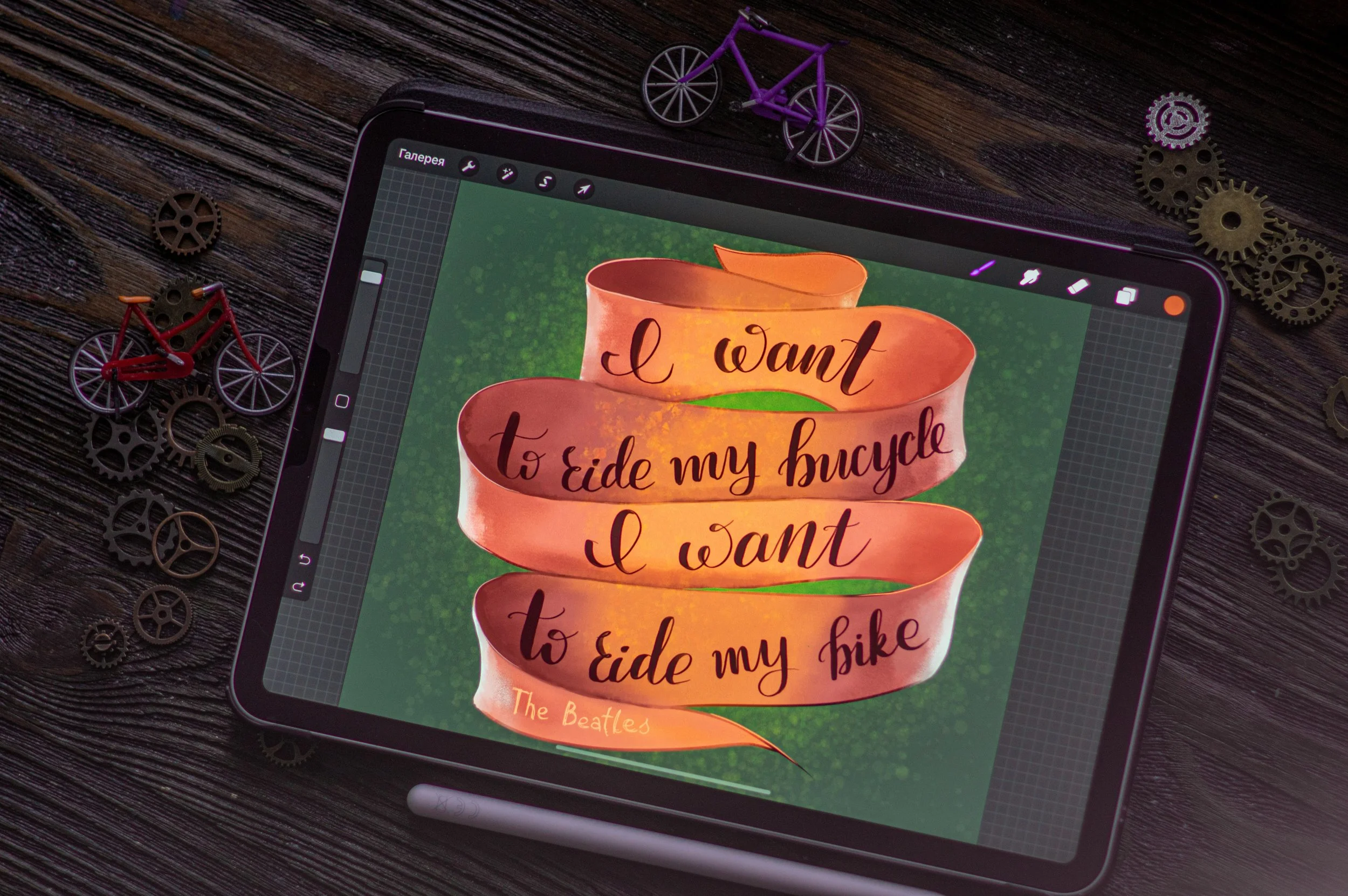
The Fix: Use guidelines! Draw or enable lines for the baseline, x-height, and cap height to maintain consistency. If you’re using Procreate, take advantage of the drawing guides.
3. Uneven Spacing Between Letters
The Problem: The gaps between letters are inconsistent, making the word hard to read.
The Fix: Focus on creating equal visual spacing rather than measuring exact distances. Squint at your work or flip it horizontally to identify spacing issues.
4. Overcrowded Flourishes
The Problem: Flourishes dominate the design, making the lettering hard to read.
The Fix: Simplify your flourishes and ensure they complement, not compete with, your text. Start with minimal swirls and build up once you’re confident in the overall balance.
5. Improper Pressure Control
The Problem: Your thick and thin strokes don’t follow a consistent pattern, breaking the flow of the lettering.
The Fix: Practice proper pressure techniques. Apply more pressure on downstrokes and lighten up on upstrokes. If you’re using brush pens, test your pressure control on scrap paper first.
6. Ignoring Composition
The Problem: The layout feels unbalanced, or the text doesn’t fit the space well.
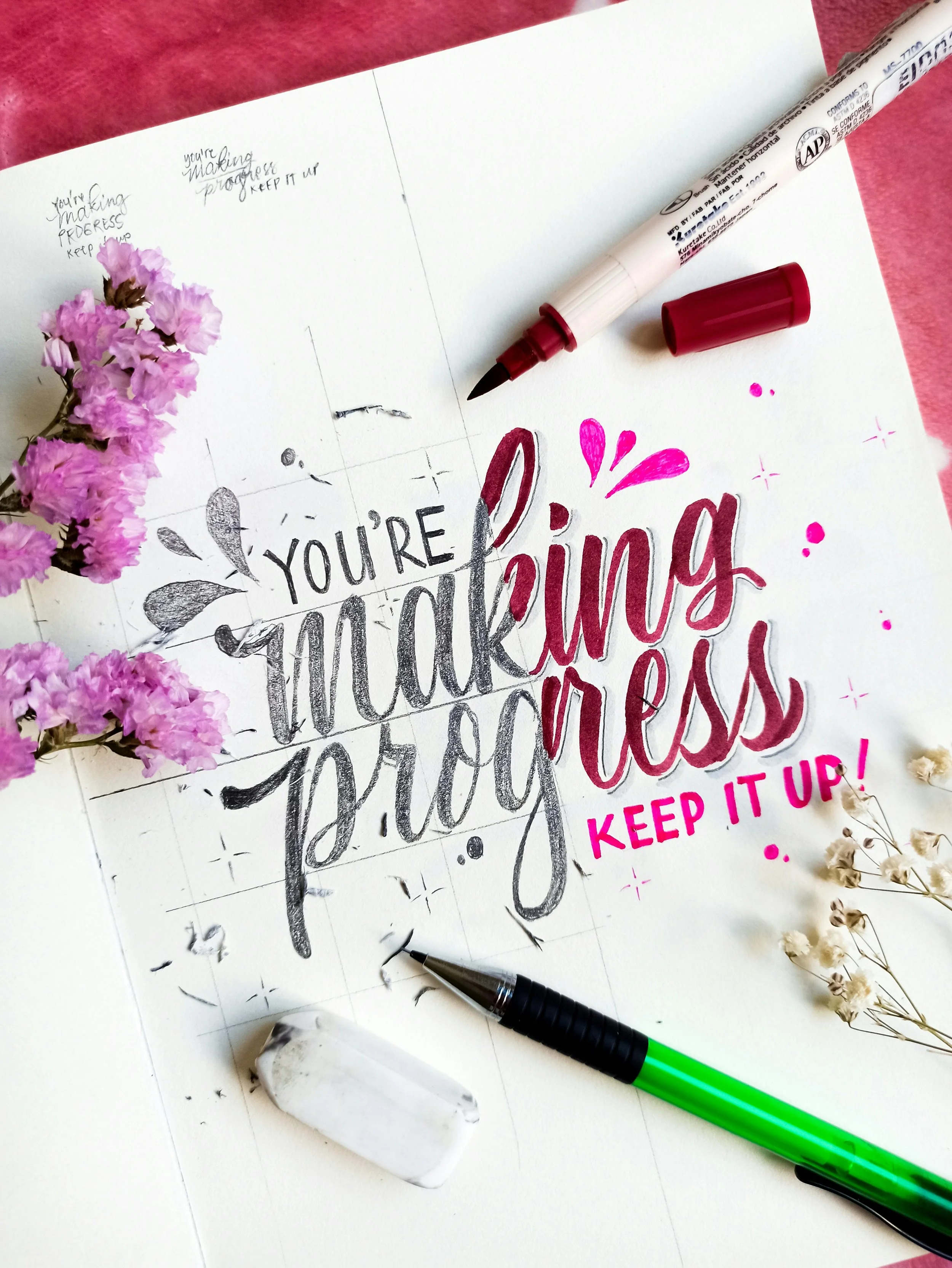
The Fix: Sketch your composition first. Use shapes or grids to map out where each word or phrase will go. Experiment with alignment and spacing to create a cohesive design.
7. Using the Wrong Tools
The Problem: Your tools don’t match your desired outcome, leading to frustration.
The Fix: Choose the right tools for your project. For beginners, brush pens or digital brushes with stabilization are great options. Experiment to find what works best for your style.
8. Overcomplicating Styles
The Problem: Combining too many styles in one piece creates visual chaos.
The Fix: Stick to one or two complementary styles in a single design. Use contrast—like pairing a bold sans serif with a delicate script—to add interest without clutter.
9. Skipping Practice
The Problem: Your lettering doesn’t improve because you’re not practicing consistently.
The Fix: Set aside regular time to practice. Start with basic drills like lines, ovals, and simple letterforms before moving on to complex designs. Consistency is key.
10. Lack of Planning
The Problem: Diving straight into your final piece results in mistakes and wasted time.
The Fix: Always start with a rough sketch. Plan your layout, spacing, and style before committing to the final piece. This saves time and ensures a better result.
Lettering is a skill that takes time and patience to master, but avoiding these common mistakes will put you on the right track. With consistent practice and attention to detail, your lettering will transform from wobbly and inconsistent to polished and professional. Happy lettering!
Join the Conversation!
Have you made any of these lettering mistakes before? What’s been the hardest part of improving your lettering? Let’s chat in the comments—I’d love to hear your experience!
Exclusive Freebie for Lettering Artists!
"Sign up for my newsletter and get a free lettering practice guide to refine your technique! Plus, you’ll receive more design tips, freebies, and early access to new digital assets. Join here!"


