
Mid-century lettering is a fascinating blend of bold, playful, and experimental design choices that reflect the optimism and innovation of the 1940s-1960s. Whether you’re working on a branding project, designing posters, or creating custom lettering, understanding the nuances of mid-century typography can help you craft work that feels both nostalgic and timeless.
In this guide, we’ll dive deep into:
-
What defines mid-century lettering
-
The different styles and their characteristics
-
Step-by-step techniques for recreating the look
-
How to apply mid-century lettering to your designs
Let’s get started!
What Defines Mid-Century Lettering?
Mid-century lettering reflects the cultural and technological shifts of the time. With influences from post-war industrialization, space-age optimism, and modernist design principles, mid-century typography is diverse but shares a few key characteristics:
✦ Hand-Crafted & Imperfect
Unlike today’s digitally precise fonts, mid-century lettering was often drawn by hand or painted on signage. Even in printed materials, letterforms retained a warmth and slight irregularity, giving them personality.
✦ Playful & Expressive
Many mid-century fonts, especially those used in advertising and signage, had exaggerated curves, bouncy baselines, and varying stroke weights, creating a friendly, eye-catching look.
✦ Clean, Geometric Shapes
Influenced by the Bauhaus and Swiss design movements, mid-century typography also embraced simplicity, using geometric sans-serifs like Futura and Helvetica.
✦ Atomic Age & Space-Age Influence
During the 1950s and 60s, futuristic themes inspired lettering styles with sharp angles, asymmetry, and unconventional letterforms, often seen in Googie architecture and signage.
Popular Mid-Century Lettering Styles & Their Characteristics
Googie-Inspired Lettering (Atomic Age)
Characteristics:
-
Asymmetrical and exaggerated letterforms
-
Sharp angles and curved strokes
-
A futuristic, space-age feel
-
Often combined with starbursts and boomerang shapes
Examples:
-
Vintage diner signs
-
Motel and bowling alley signage
-
1950s sci-fi movie posters
-
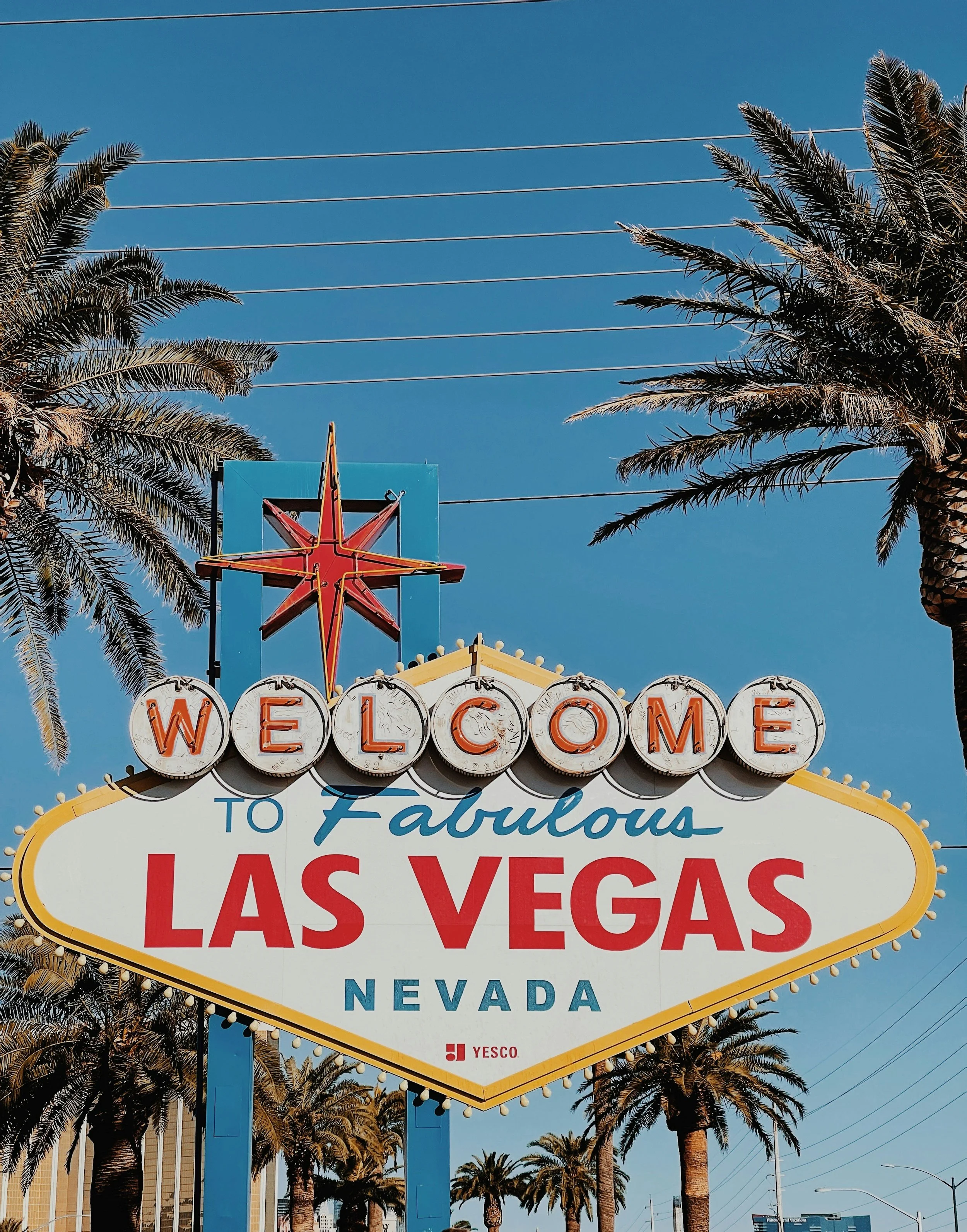
Example: The famous “Las Vegas” sign
How to Recreate It:
-
Use slanted or off-kilter letters for energy
-
Exaggerate stroke variations (thin-to-thick transitions)
-
Add atomic-inspired embellishments like dots or sparkles
Hand-Painted Sign Lettering
Characteristics:
-
Casual, brush-stroke texture
-
Often slanted or slightly irregular
-
Friendly, approachable feel

Examples:
-
Vintage grocery store signage
-
Diner and drive-in menus
-
Retro gas station branding
How to Recreate It:
-
Use a brush pen or textured digital brushes to mimic brush strokes
-
Let letter spacing vary slightly for a natural look
-
Keep strokes loose and avoid perfect symmetry
Geometric Sans-Serifs (Mid-Century Modern)
Characteristics:
-
Clean, minimalist, and structured
-
Simple letterforms with even stroke weights
-
Often all-caps for a modern feel
Examples:
-
Corporate branding (IBM, Volkswagen)
-
Mid-century furniture ads
-
Bauhaus-influenced posters
How to Recreate It:
-
Use typefaces like Futura, Avenir, or Century Gothic
-
Keep spacing tight for a compact, modern look
-
Stick to simple, bold layouts with clean alignment
Slab Serifs (Bold & Rugged Look)
Characteristics:
-
Thick serifs and heavy letterforms
-
Blocky and masculine, often used for advertising
-
High contrast between thick and thin strokes
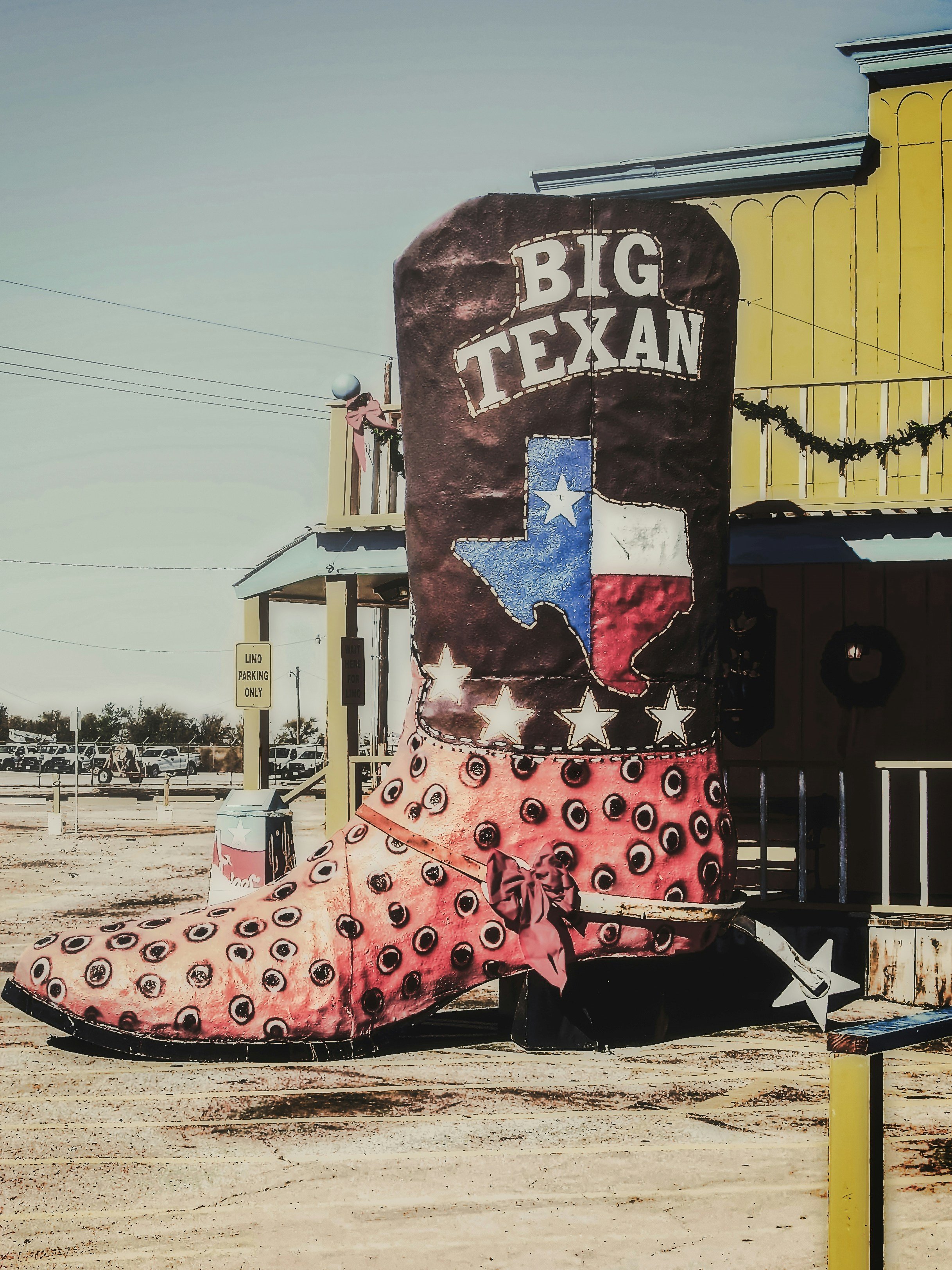
Examples:
-
Vintage Western-style posters
-
Beer and soda packaging
-
Industrial and workwear branding
How to Recreate It:
-
Use strong, slab-serif fonts like Clarendon or Rockwell
-
Add slight texture for a printed, distressed look
-
Pair with bold colors for extra impact
Playful Script Lettering
Characteristics:
-
Curvy, fluid strokes with high contrast
-
Often slanted for a dynamic, energetic look
-
Can be elegant or casual, depending on stroke weight
Examples:
-
1950s advertising (Coca-Cola, Ford)
-
Greeting cards and product packaging
-
Neon signs and retro restaurant branding
How to Recreate It:
-
Use thick-to-thin brush strokes for a dynamic feel
-
Add slight bounce to the baseline for personality
-
Pair with retro illustrations or textures for authenticity
Step-by-Step Guide to Creating Mid-Century Lettering
Step 1: Gather References
Before you start sketching, collect inspiration from vintage ads, matchbooks, posters, and signage. Pay attention to letterforms, spacing, and textures.
Step 2: Sketch Your Lettering by Hand
-
Start with a rough pencil sketch to establish the overall shape and style.
-
Focus on exaggerated curves, sharp angles, or geometric precision, depending on the style you’re mimicking.
-
Don’t worry about perfection—mid-century lettering has a natural, hand-drawn feel.
Step 3: Refine & Digitize
-
If working digitally, use Procreate, Adobe Illustrator, or Photoshop with custom brushes to refine your lettering.
-
For a clean vector look, trace your sketch using the Pen Tool in Illustrator.
-
If aiming for a hand-painted effect, keep slight imperfections for an authentic touch.
Step 4: Add Texture & Details
-
Apply grainy textures, halftones, or subtle ink distressing for a vintage printed look.
-
Consider slightly misaligning letters for a hand-done effect.
-
Experiment with retro color palettes (mustard yellow, teal, burnt orange, dusty pink).
Step 5: Finalize & Apply to Designs
-
Test your lettering on mockups like posters, T-shirts, packaging, or signage.
-
Pair it with mid-century inspired illustrations or patterns to complete the look.
-
Play with layering and depth to add authenticity and visual interest.
Where to Use Mid-Century Lettering in Your Designs
✔ Logos & Branding – Ideal for businesses that want a nostalgic yet fresh identity.
✔ T-Shirts & Posters – Great for screen-printed merch with a retro vibe.
✔ Signage & Menus – Perfect for restaurants, coffee shops, and boutiques.
✔ Packaging & Labels – Works well for vintage-inspired food and beverage products.
✔ Social Media Graphics – A fun way to make posts stand out with nostalgic appeal.
Recommended Resources
Books & References:
Scripts: Elegant Lettering from Design’s Golden Age – Steven Heller & Louise Fili
Mid-Century Modern Graphic Design – Theo Inglis
Fonts to Try:
✦ Pacific Northwest (Hand-Painted Script)
✦ Motel King (Googie-Inspired)
✦ Futura PT (Geometric Sans-Serif)
✦ Clarendon (Slab Serif)
Final Thoughts
Mastering mid-century lettering is about embracing its imperfections, playing with bold shapes, and adding personality to your designs. Whether you’re designing a T-shirt, a brand logo, or a poster, mid-century typography brings warmth and nostalgia that stands out in today’s digital world.